Sunday, September 29, 2013

In the Art Room: The Andy Warhol Mural

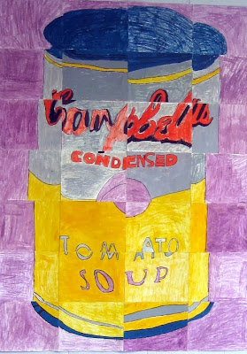
So you've seen it as a backdrop to some crazy DIY Campbell's dress, now it's time to shine some light on this 4th grade mural. In case you don't know the back story, I'll give it to you in 20 words or less: parent wanted posters for upcoming canned food drive; I wanted a mural for the cafeteria; student teacher Rebecca suggested this. Because she's a genius.

Because the kids were in the middle of creating their dots for this project, I decided to ease them into all things Warhol with a coupla of my fave books: Getting to Know the World's Greatest Artists by Mike Venezia and Dropping in on Andy Warhol by Pamela Geiger Stephens and Jim McNeill. As the kids finished off their dots, they trickled to the floor as I read. By the way, one little trick I use to reinforce the names of artists is this: as I read, I'll only read the artist's first name and the kids are to say the last name. I've found this really helps them retain the names of artists...although I have had this happen on more than one occasion:

Me: Vincent...

Kids: DA VINCI!

So, it's not a perfect formula.

 Speaking of Vincent da Vinci, er, van Gogh, here's a Starry Night mural created by this same group of kids way back when they were in second grade town. So they are experts at this grid-thang.


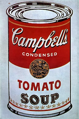
Because this project was all Rebecca's idea, she did the planning. She found this image online and created a grid that would provide at least one image per student. We have between 24 - 25 students per 4th grade class so some early finishers were given another piece of the pie, er, can to draw. Rebecca made several copies of this can and colored each of those copies in a different Warhol-inspired color scheme.
This is actually one of the color schemes that didn't make the cut but I thought I'd share it with you to give you an idea. After each of the 4 copies were colored, Rebecca then cut them along the gridded lines.
And here's how they looked chopped to bits. Each 1" X 1 1/2" (and that's a rough measurement) was given a code on the back to help keep when gluing down the pieces. Each student was given a piece of paper that measured about (and I'll have to get back to you after a visit to school tomorrow for a more accurate measurement) 10" X 12".

Each of the 4 class' different cans cut, organized and clipped. Which would be all Rebecca's doing as I'm not nearly as organized as that gal.
Directions went a lil something like this: 
  • Name and code (as seen on the back of the small paper) on the back of drawing paper
  • As you start your drawing, look at the 4 edges of the little square. Where you see the beginnings of a line, like the curve of a can or the start of a letter, put a little tick mark on your drawing paper. Think about the scale of the drawing and how you will have to enlarge your drawing to make it to scale.
  • Use a pencil, trace with sharpie, color with corresponding colors in oil pastel.

I'm not gonna lie, the lettering, especially the cursive font of the "Campbell's" wasn't a walk in the park. For those kids, another demo was given, this time more of a one-on-one or with some peer-tutoring thrown in the mix, and it worked. The kids really seemed to enjoy the process and they loved the result. As they finished their pieces, Rebecca spray glued them to a large sheet of bulletin board paper which you can see the pink coloring of in the photo below.
Okay, despite the fact that there's a glue bottle on the ladder, I promise you no Elmer's was used in the hanging of this piece. We had a couple of drawings where the edges were coming off the bulletin board paper and that glue was our solution. We had a wee bit of tack strip at the top to hang the piece from...but that didn't solve the dilemma of the fly-away-bottom (which sounds like a personal problem, if you ask me...symptoms of fly-away-bottom include a bottom that just won't stay attached, use Elmer's Glue only as directed). So, we resorted to the Hotter than Hades glue gun (seriously, I watched it burn a hole clear through my fingernail and It. Was. Awesome) which, at my school, is a Big Fat Hairy No-No. But my principal's away on maternity leave, and, as the saying goes, when the principal's away, the art teachers are gonna hot glue the crap outta the school. Or something like that.

I can't believe that in just two weeks, this girl is gonna leave me! I mean, how could she?! What am I supposed to do, teach or something? That's just crazy.
A coupla more close-ups. In retrospect, a chat about David Hockney's photo collages would have been a great tie-in with these cans.
Since Rebecca had to go and teach, she left hanging the last coupla cans in my hands. No problem, says me, I got this!
And with one tug on the extension cord, I managed to make this magic happen. Sigh. Seriously?! I really don't think this girl outta leave me, do you?

In all seriousness, I hope you'll give a big ole mural a-go at your school. The impact is amazing and the kids love it. If I've failed to answer any of your questions, please feel free to either email me or leave a comment...and I'll try my best to answer your questions. And thanks for dropping by!


Wednesday, September 25, 2013

DIY: Campbell's Soup Dress after Andy Warhol

Forget the dress, check out that soup-er mural! It's simply un-can-ny how much it resembles the work of Warhol. More condensed details on the fourth grade's latest masterpiece soon, but for now the h-Andy work of this dress will just have to be suffice. Or is the word "sufficient"? Eh, you say "tomato", I say "shut up, fool!" Because I'm rude like that. 
I dunno how you spent your weekend, because, as I mentioned, I'm rude and therefore forgot to ask, so lemme just tell you how I spent mine: Making a Campbell's Soup Can Dress in honor of our artist of the month, Andy Warhol. Oh! And did I mention that I almost committed sew-icide (death by sewing a nightmarishly impossible task)? Because I did. Seriously. Each one of those appliqued letters was at least ten years off my life. Which I don't suppose is possible being that there are 19. But whateves. Me and math have never gotten along.
You might recall I'm on a bit of a mission to create an outfit for each of our artists of the month. Thus far, I've managed to sew up a Great Wave dress in honor of Hokusai and a splatter-tastic number for Pollock. And now I can add some Andy Warhol to my dress-terpiece wardrobe. Yippie! It only shaved 190 years off my life (and, yeah, it took me from initially mentioning that math problem until now to come up with the answer)!
This whole mess, er, dress started when a sweet parent approached me about having the kids create posters for an upcoming canned food drive. I'd already had it in my head that our school's cafeteria needed a new mural and had mentioned such to Rebecca. With her big soon-to-be-an-amazing-art-teacher brain, she thought up the idea of the kids creating a class set of Andy can murals. And the rest is history (with details to come, pinkie swear and spit shake).

Check it out: the Souper Dress is a screenprinted paper dress that was made and sold by Campbell’s Soup Company in the late 1960s. Obviously, the creation of this dress was inspired by the one and only Warhol. How I'd love to get my kitten mittens on this number...if only it wasn't selling for hundreds of dollars on that devil website known as ebay.
 While student teacher extraordinaire was busy workin' on that, I was plotting my outfit to accompany said lesson. Because if it's one thing I've got, it's priorities. And a serious lack of mathematical skillz.

 
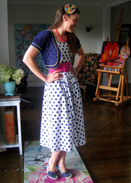
My mom happened to spot this dress on a recent thrift store jaunt and, knowing my can-plan, scooped it up for me. Can you believe it's perfectness? I swear this bad boy was just beggin to be Campbell's-soup-ized. To can-onize this dress (because after all the work, I'm declaring this thang a holy relic), I added a silver ban to the top and bottom. I didn't shorten the dress at all although in this side-by-side it appears that way. And, of course, I appliqued the crap outta the thing with all 19 of those letters. Not like I was counting or anything. Ahem.

Now I never really go about anything the right way or even the easy way, so if you are gonna embark on your very own Warhol number, might I suggest you go to a legit DIY blog. However, if you are up for a challenge of sew-icidal proportions then, welcome to the Thunderdome, friend! Grab your Xanax and let's hop to it! 

I began by laying my dress out and placing a sheet of tissue paper on top of that. I kinda love lettering so planning the size of the letters and penciling them in was fun for me...in a I-like-to-pick-at-my-hang-nails fun kinda way.
After that, I chose the fabric for my letters and ironed some fabric stiffener to the back. Wait, there's another name for that, right? Because "fabric stiffener" just can't be right. That makes it sound like I showed the fabric some dirty pictures of sewing machines and thread and it got all hot and bothered. And that's just weird. Wait, what were we talking about? Lemme start again, sorry...

Iron some stuff on the back of the fabric that will beef it up (heehee), pin tissue paper to fabric and cut. Wow, I managed to get all that out in one sentence when it took me an entire paragraph above.
Because I thought the pins would create puckers in the fabric when sewing, I tacked the letters down with Stitch Witchery which is that roll of stuff on the left.
And then the appliqueing commenced. Which, as you can see, is just a zigzag stitch really close together. I struggled with turning the curves of the letters which shoulda been a harbinger (the one SAT vocabulary word I actually remember) of what was to come with those curvy swirly "Cambell's" letters.
Speaking of...I actually contemplated felting these letters in place knowing they were to be a beast. But I opted to first give it a shot applique-wise and then resort to felting if needed.
Are there any pro-applique'ers out there? Because one look at this photo and you can see I'm strugglin'. Pushing all the fabric of the dress through the machine was not my cup of tea. Do the Real Housewives of Applique-town have a certain machine with a longer sewing machine arm, a flatter presser foot and a built-in margarita maker, perhaps?

When it was all said and done, I was pretty happy with my goofy dress. Which provoked mucho commentary when I hit the grocery store after school. Here's just a pinch of the convo I engaged in at the checkout counter:

Checkout Clerk: Oh! I love your dress! Did you make it?!

Me: Um, yeah. I did.

CC: Oh my goodness {Calling to the other checkout clerks:} Hey, guys, come over here and see this dress! She made it! 

Awkward Checkout Clerk: Neat. {Looking in my cart} You aren't buying any soup? That seems weird.

Me: Yeah, well. I'm trying to cut back.

ACC: That's too bad. {Checkin' my dress out again} I hear it's "Mmmm...mmm...good." Can I help you out with your groceries?

Me: {Trying to suppress my freaked'outed'ness}NO! I mean, no. Thanks.

Stay tuned for the post on how the fantastic fourth grade created these murals. Until then, finish that soup! AND stay away from Awkward Checkout Clerks. Toodles!

Monday, September 23, 2013

What the Art Teachers Wore #78

Dots and Stripes Monday: There was once this teacher poll that went around my school where we could vote for each other, senior year style. You know, like "Best Dressed" (which I'm still ticked I didn't get, some people just don't know style) and "Best Hair". Guess who was "Most Likely to Wear Dots and Stripes Together"? That's right...dress: vintage, thrifted; sweater: Betsy Johnson, Plato's Closet; sandals: Shoe Carnival
I know what you're thinking, "Didn't I just hear from this crazy yesterday?!" Well, you'll have to forgive me, but I've got a bit of a blog backlog I'm trying to catch up with. I've got oodles of DIY's, art lessons, an ear wax extraction story that's not to be missed and, believe it or not, a whole post full of advice-giving goodness. No, I'm not kidding about that last part. Yes, some folks have been asking me, me of all unsane people, for life-living tips.

 Stop. Laughing. And pointing. That's just rude and it hurts my feelings. Jerk.

In other news (ahem, changing the subject in hopes that you'll stop the heckling), this here's the final installment of all things dot-gasmic.  You might recall, I've managed to wear nuthing but dots for the last two weeks in honor of Peter H. Reynold's The Dot. More on that here and here. Turns out I had just enough clothes to make it until the very dotted end with one spotted skirt to spare. And to think I thought I just wouldn't make it. I underestimated my own hoarding powers.

To wrap up all this dotted'ness, I thought I'd share with you some of my fave dotted paintings. I hope you dig 'em. Until next time!
Wassily Kandinsky, Several Circles, 1926 This series of trippy dot paintings are among my favorites of his. I like them better than his heavier looking works like the painting below...
Kandinsky, Concentric Circles, 1913


Feelin' Groovy Tuesday: This four dollar antique store dress always makes me feel so 1960's hip. dress: vintage; tights and belt: Target; shoes: Clarks; poodle pin: gift from a friend

Rebecca and I were so busy this week that we rarely remembered to take outfit photos this week...not to mention find out the details of her outfit. Pretty sure more of her wardrobe is Target or Anthro. Can't go wrong with either.

Are you familiar with the modern day pop artist Ryan McGinness? I love his work, especially these black light pieces from 2009. The overlapping script lines are so beautiful to me and the pop of color against the back is stunning. Now if only he could get the circles to rotate like a kaleidoscope, my mind would be blown.

Seriously. I've now got an art-craving to bust out my calligraphy pens and doodle like mad.

Betsy Johnson-Wannabe Wednesday: I found this dotted dress at Plato's Closet for $3 and I had to have it in my life. Sadly, the thing was just too short. So I added the leopard jersey print to the bottom and suddenly it was just a smidge less inappropriate. Success! dress and belt: Plato's Closet; shoes: ancient Anthro

Daw, she so cute.

Dan Christensen, O-Zone, 1988. I recently stumbled upon this artist and, I gotta tell you, I love his stuff, especially those dotted pieces below. He's apart of a group of artists called the Color Field movement. These artists were interested in exactly what it sounds like: large fields of color. And alternative means of applying color to their canvas. Here it looks like he might have used a giant airbrush to me.

Gah, I could stare at this all day. Well, not all day, I might go a little mental(-er) but I do love them. Especially how the dots seem to vibrate and move.

Like a circus without the creepy clowns, corn dogs and cotton candy.

Open House Thursday: Otherwise known as The Day Without End. But it was so much fun seeing the kids and chatting with their parents. dress: vintage, thrifted; shoes: Irregular Choice

So Gary Andrew Clark is the artist behind these dotted works. They remind me of Warhol meets Chuck Close on some sort of Alternate Universe Futuristic Planet. What I really like about these is that you can scoop 'em up for about $40 a pop here.
Who dat lady?!
FRIDAY, You Finally Made It!: It only took you forever. dress: ancient, Francesca's; shoes: Anthro

I know those happy pants came from Anthro. Aren't they adorbs? And, yes, I just used the word "adorbs". Deal wit it.

So I don't suppose I can go a whole post talking about dots and NOT mention Georges Seurat. I mean, dude put in his hours of pointillizing the daylights outta this canvas, I gotta give him a shout out for that. On a totally different subject, I bet that lady with the umbrella could out-twerk Miley any day, dontcha think?

On that note, I'll end this here post. Before the train to inappropriate town makes another stop to you's-about-to-lose-yer-job land. Later!