Recently, my kindergarten and first graders created guided painting symmetrical butterflies! This is a very old lesson of mine...which you can find here. The video I created then was geared toward art teachers. I decided to update the video and make it so you can share it with the artists in your life. Here you go:
Of course you'll need to pause as they go.
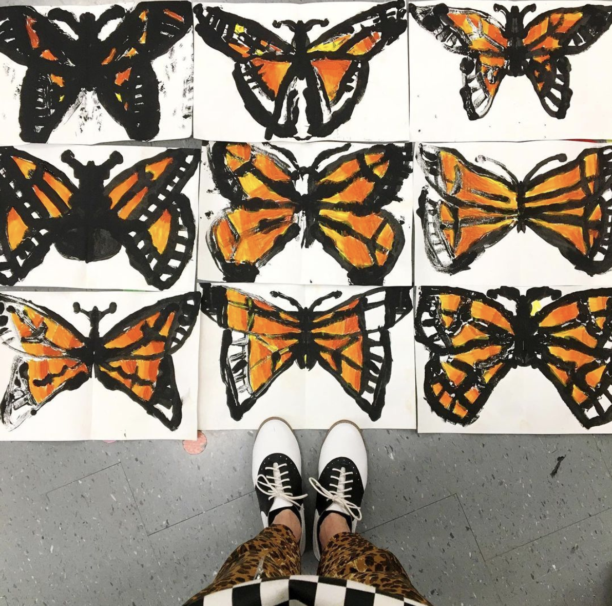
We used black tempera paint and I told the kids to apply the paint so that it is shiny. This made for a better print. Once they understood how the process worked, they knew what to do.
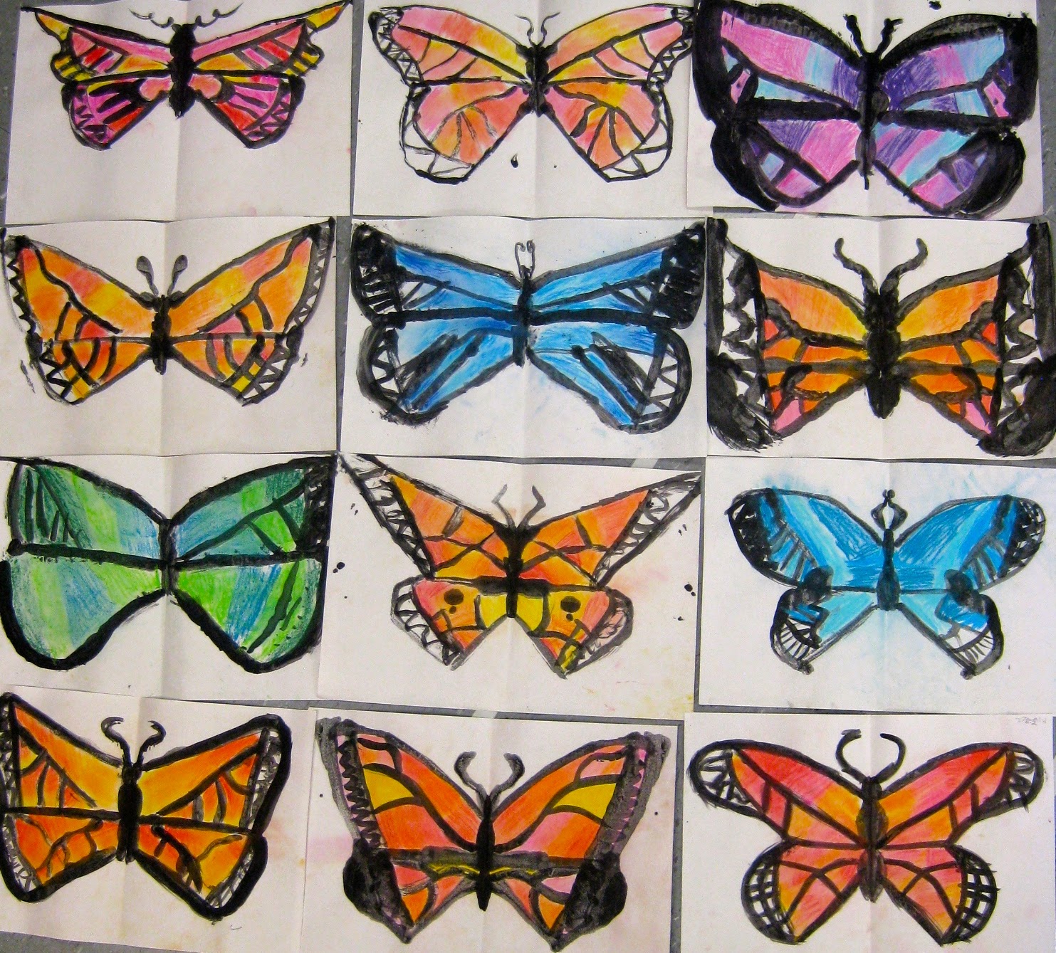
Color was added with brown, yellow and orange oil pastels. The kids were told to color in those three colors in stripes and then color OVER those three colors with yellow to create a gradation. Afterward, we drew designs in the background with a white oil pastel and then added color to the background with blue liquid watercolor. Have fun!
Next week my super awesome second grade students are going to be involved in a street painting event! Chalk artist Lee Jones will be coming to our school and working with the second grade to create street paintings. Because the kids are learning about the Monarch butterfly in their classroom (they'll be getting their very own caterpillar this spring), I thought they could chalk butterfly designs. To practice for next week's event, the kids busted out these butterfly beauties this week. I popped a photo of 'em up on my instagram yesterday and it blew up with questions. So I thought I'd try to answer 'em today. Let's hope it makes a smidge of sense.
This lesson was short and sweet. It took us a grand total of two 30 minute art classes to complete. Here is a list of supplies we used: * 12" X 18" paper folded in half * watered down black tempera paint (I love Sax's Versa Temp) * paint brushes * KOSS chalk pastels
During the intro to this lesson, we chatted briefly about our upcoming visit from Lee Jones. I then introduced the Monarch butterfly to the kids with this prezi. Feel free to borrow away!
After that chat, each student collected the paper and paint brushes. They jotted their names down on their papers and immediately turned their attention to me. At this point, we only had a short 15 minutes to get this bad boy painted so there was no time to lose.
This painting process was great because I could introduce all sorts of groovy math terms like symmetrical and parallel. I made a short clip for y'all to explain the process. I do hope it helps! You can find more of my lesson video clips here.
Like, Holy Cats, how simple is that, right?!
And I love how each one turned out. I got the idea this weekend when I googled butterfly artists. Of course, my homeboy Andy popped up.
This summer when I taught a workshop based on an Andy Warhol exhibit, the docent revealed just how Andy accomplished that blotted look which he is so known for in his early work. Apparently he would paint with ink then blot his work with a paper. This would give the effect of an uneven line. I thought this would be a great way for the kids to create their butterflies as well.
In the video clip, I mention how I tell the kids that something is "practice". I often tell the children that to have them relax a bit. If they think that it's just a fun creative experience (cuz, duh, it is), I've found that they loosen up a bit and let go of the notion of perfection. 9 times outta 10, they grow to love their "practice" piece so much that they never ask to start again.
Some kids were bothered that the line didn't appear as clearly once printed. In which case, some repainted those lines on the other side.
Now let's talk chalk, shall we? I purchased this KOSS chalk just for our sidewalk painting event. And, I gotta tell ya, we've been using it nonstop since I got it! My third graders are currently chalking these lovely desert landscapes. This chalk is loaded with pigment and it's just so stinkin' rich. Check it out, y'all! On the second day of art, I told the kids that there were just a coupla tips for chalking: they shouldn't use more than three colors and the colors should be analogous. Notice all the warm colors at the top? Those colors look great together! Pick three from that side. Love all the colors at the bottom? Perfect, they love being with each other, feel free to pick three from there. But mixing the two sets of colors may result in dull colors. And who wants a dull butterfly y'all? That's what moths are for!
A kid after my own heart: mixing the chalk with her fingers. Some used tissues but I found that often wiped the color away.
Many kids went the Monarch route...
While some wanted theirs to be "camo-greens". Sargent Flappy Wings. You got it!
Each one of 'em was an absolute stunner. I cannot wait to see just what these kids chalk outside!
By the way, I think I'm in love with the white background. The kids and I chatted about cutting them out ("Let's hang them up! From the ceiling!" Oh, yeah, kids. The Fire Marshall would LOVE that!). For now, I think they'll stay this way. But if you have any suggestions, I'd love to hear 'em! Until next time, y'all!