Tuesday, September 30, 2014

DIY: A Keith Haring Inspired Pleather Ensemble

What I've got for y'all today is an ensemble brought to you by the exquisite fabric known as pleather. Which I have decided can only be pronounced as "plehh-thahh" in a deep and gravely Barry White voice, preferably followed by a "baby". As in, "I wanna wrap you in plehh-thahh, baby, plehh-thahhhhh." And just who doesn't want be draped from head-to-toe in leather fauxness with Barry White at their beck and call, hmmm? 

Little known fact: pleather actually comes from the rare and annoying creature known as Twilight Sparkle. Hence the smell of plastic and rainbows shot from unicorn anus. 

So I got this idea to draw all over my clothing from one of my fave artist blogs Alisa Burke. Y'all. I totally hate it when chics say the have a "girl crush" so, well, lemme just put it this way: I totes have the lady hots for Alisa. She's like a Super Crafty Genius. Sometimes, I visit her site and I'm all "GAH! She's done it AGAIN!" and commence shaking my fists at the heavens wondering why some folks be all touched with the crafty-gene and I ended up with hammerhead toes. HAMMERHEAD TOES, Y'ALL (and, to that freaky-deaky person who keeps messaging me about wanting to see more pictures of my feet, STOP. It's not gonna happen, 'kay?). Life just ain't fair, y'all.
As soon as I saw Alisa's jacket, the idea of doing the same with a Keith Haring theme popped into my head (along with "squirrel!" and "unicorn anus!" but that's pretty normal). I scoured the interwebs for super cheap plehh-thahhh (see, I told you, I can't say it any other way. Bet you won't be able to either after this post) and found that Forever21 had this circle skirt on the cheap. Not wanting to pay shipping costs, I decided to venture to the mall (anyone else abhor the mall? Gah, I feel like I'm stepping back into a 1990's time machine each time I enter one. Orange Julius, anyone?) and scooped one up.
I gotta tell ya, the last time I wore a plehh-thahh skirt it was my 11th birthday, I was in 6th grade and we were bringin' the house down at Chuck-e-Cheese. I tried my hardest to find a photo from the occasion but, alas, I think I may have taken one look at it, thought, "OMG, why am I wearing maroon pinstripe pleather?!" and tossed it. Sorry, y'all!

After my shopping fun at the mall, I popped over to the craft store and scooped up a coupla of Sharpie oil-based pens. I also picked up a couple of terrible fabric makers which sucked unicorn anus. Thusly, I don't recommend them. 
Once I got home, I did a quick search for Keith Haring/black and white and this is what popped up. I loved it so much (look at the scissor people, people!) I decided it would be the perfect inspiration. 
I began by sketching out my Haring-inspired designs in chalk but that proved to be too time-consuming and did a number on the tip of the Sharpie. Since Harings designs are pretty simple, I decided to just let it goooo and draw 'em with reckless abandon. 

Are y'all fans of Keith Haring? I feel like he was such a revolutionary artist not necessarily because of his style but because of the boundaries that his artwork removed. In the 1980's his graffiti artwork could be seen by anyone who happened by it, not just those "in the art world". He removed the mystic of the artist by working out in the open on grimy subway walls in his cartoonish hand. Not only that, but his artwork brought to light issues that were close to Haring's heart: AIDS awareness, sexuality, apartheid and war. Dude was Banksy before Banksy. Suddenly art became by the people and for the people, thanks to Keith Haring.
Once I was finished with the plehh-thahh skirt, I decided a biker jacket was needed to top it all off. Barry White insisted. 
Gotta tell ya, I've been wanting a vintage biker jacket for ages. However they cost exactly One Million Dollars and, despite my ginormous art teacherin' paycheck, I just ain't got that kinda dough. So a plehh-thahh biker from Forever21 it 'twas (dude. Do you know how awkward it is to shop in a place called Forever21 when you are really Forever 39?).
For this jacket, I really wanted to stress Harings more popular images like the people holding the heart, the barking dogs, the radiant baby and the cartoon face on the television. Other than that, I had seriously no plan at all, didn't draw in chalk or nuthin. I just went at it. 


And the result is pretty busy, I gotta say. However, I kinda dig that it doesn't match the skirt. I like that the skirt has more negative space so you can see the images better. By the way, do you even know how stinkin' hot head-to-toe plehh-thahh is?! And by "hot" I don't mean "hawt", I mean butt-sweat hot. You can thank me for the visual imagery in the comments.
Once the temps dip a pinch, I think this will be so much fun to wear. I'm thinkin' I will get a lotta mileage outta that jacket.
OMG, I just realized, I look like The Fonz!
Who has two thumbs and loves plehh-thahh?! Eeehhhhhh. This guy.
Oh, Fonz. You so cray.
And with that, one more artist-inspired ensemble in the books! 

 photo signature_zpsd10b3273.png

Sunday, September 28, 2014

What the Art Teacher Wore #116 and an Art Project Update

Oh, Flowery Day!: I've already started the long-drawn out process of packing up my summer duds and replacing 'em with fall frocks (which I'll do all over again in two months when I pack up the fall clothing and bust out the winter stuff. The fun of being a clothing hoarder never ends. Sigh). Howevers, since we are learning about colorful Latin America, I wanted to dress the part one more week before saying adios to all my colorful clothes. dress and belt: thrifted; jacket: Lucky Brand; sandals: Frye; big fat hair flower: DIY
And another photo because I just wanted you to see the back of this groovy jacket. I can't take credit for it but it's long inspired me to do the same to some snooze-fest sweaters in my closet. 

Well, hello there, kids! I dunno about you but these past coupla weeks have seemed to swallow me whole. By the time I get home from work, make some feeble attempt at cooking dinner (by the way, am I the only one that will occasionally [and by "occasionally", I mean once a week] have Pop Corn/Ice Cream dinners?) and kinda clean, up it's practically bedtime. Which is driving me crazy because my DIY mountain is piling up. My sewing room currently looks like a studio for a dozen different nut-job artsy types who lack direction and have seriously low standards of cleanliness. Which is pretty much how it always looks, dunno why I'm acting like that's anything new. 

Aside from all that slack-tasticness, I gotta tell ya that my email inbox has been filling up with some super fantastic Costume Contest entries! Are y'all planning on dressing up as an artist or artwork? If so, don't forget to send your photos my way (cassieart75@gmail.com) to enter to win a feature here as well as spot in SchoolArts magazine! Looking forward to see your costume!
In other news, I'll be speaking at Bowling Green State University Monday, October 6th! I'm excited to share with y'all how I use my (questionable) fashion sense as an inspiration for teaching. At least I think that's what I'll be sharing. Regardless, I'd love to see and meet you there!

All that aside, I thought I'd share with you the start of some Latin American-inspired work that my students began this week. Last week, you saw our inspiration and now here's a sneak peak at our works-in-progress. What in the world are your kids doing in the art room this week? 
In first grade-ville, we're working on our Amate-inspired drawings of floral and fauna. After learning about Mexico, Amate paper and macaws, we were introduced to a lil Spanish by this guy:

That's right, I totes upped my geeky art teacher game and used this giant macaw puppet to teach the kids Spanish as well as the primary colors (thanks, Folkmanis, for that wise choice of feathers!). I picked up this guy from amazon and the kids loved him. They were so excited to draw their own macaws after Manuel (his name) made his appearance.
Warm/Cool Days of Fall: I never know how to dress when it comes to fall. Cool in the mornings, warm by noon, this weather is as moody as me. dress: thrifted; scarf: Urban Outfitters; belt: Anthro 
My second grade artists are working on collage landscapes with the arpilleras of Chile in mind. We worked for several days creating painted papers (inspired by one of my fave blogs, Painted Paper! Thanks, Laura!). Now that our land is complete, it's time to add some fun details. I'll keep you posted on these beauties.
Florals and Frida: Did anyone else scoop up those Frida shirts that Forever 21 was selling? Did you know they have a "Artist Series"? They've featured the artwork of Keith Haring and Jean-Michel Basquiat which is awesome. What's not so awesome is that it's usually crop tops and tube tops. Not exactly teacher attire. But I suppose they aren't expecting teachers to shop at a place called "Forever 21", now are they? Frida top: Forever 21; skirt and shoes: thrifted
My third grade is getting ready to embark on one of my fave projects: Tree Weaving. This week they created their backgrounds. We learned how to mix three different values to create space in our landscape. The kids were allowed to use whatever colors they wanted for their paintings which meant some created deserts, fields or beaches. I can't wait to see how their woven tree looks in the foreground. 
Bird Brained Friday: Since my first graders were drawing birds, I thought a bird-themed dress would be appropriate. Not that it could compete with that bird puppet, lemme tell you. They were all, "cool dress, Stephens, now BRING OUT THE PUPPET!" Kids these days, I tell ya. sweater and dress: thrifted
Lastly, we have my fourth graders Metepec suns. These kids used the same method that my third grade students did to create a three-dimensional face. Several kids are creating a sun/moon face (those are the unfinished ones). I borrowed heavily Denise Logan's book Dynamic Art Projects (great book, y'all. Check it.) but I'm planning on having the kids do a little something different for the rays of the sun. For that, you'll have to stay tuned. Until next time!

 photo signature_zpsd10b3273.png

Tuesday, September 23, 2014

In the Art Room: A Dotted Relief Sculpture

You know those flakey art teacher types that, although they've taught art for something close to 100 years, they still neglect to order art supplies until well into the school year? 

"Good heavens, no!", you say, "I don't know nor would I ever associate with any of those types of art teachers."

Oh, but you do. Hello, my name is Cassie and I am Queen of the Flakey Art Teachers. Seriously. And I've got a glitter-encrusted crayon-crown to prove it (if I could only find the blasted thing).
Why make this announcement in this here Dotted Relief Sculpture post? Because this project was born outta an empty art supply cupboard. In fact, I've rewritten a (disturbingly morbid, go here and read and tell me I'm lyin') children's poem just for the occasion. I've titled it Old Mutha Stephens:

Old Mutha Stephens
Opened her cupboard to be retrievin's
Some paint, colored pencils and glue.
But when she came there
Her cupboard was bare!
And so her students used foil and plates and didn't have a clue
That their art teacher was a Big Crazy Unorganized Flake.

(Okay, so that last bit is a work in profess, you'll have to forgive me).
What's that? You too strive to be just as flakey as me and wish to dupe your student into thinking you just dreamed up the most awesome project on the planet? Oh, well then. You came to the right place. Get yourself to the nearest grocery store and grab the following:


* Super cheapo styrofoam plates. You want the cheap ones because they cut much easier. Each kid will need two so go for the largest supply.

* Spray Glue. I like 3M because it doesn't suck. 

* Cheapo aluminum foil. The thin stuff works great.

* Sharpies in a lotta colors. 

* Glue. You know, like, Elmers or something.


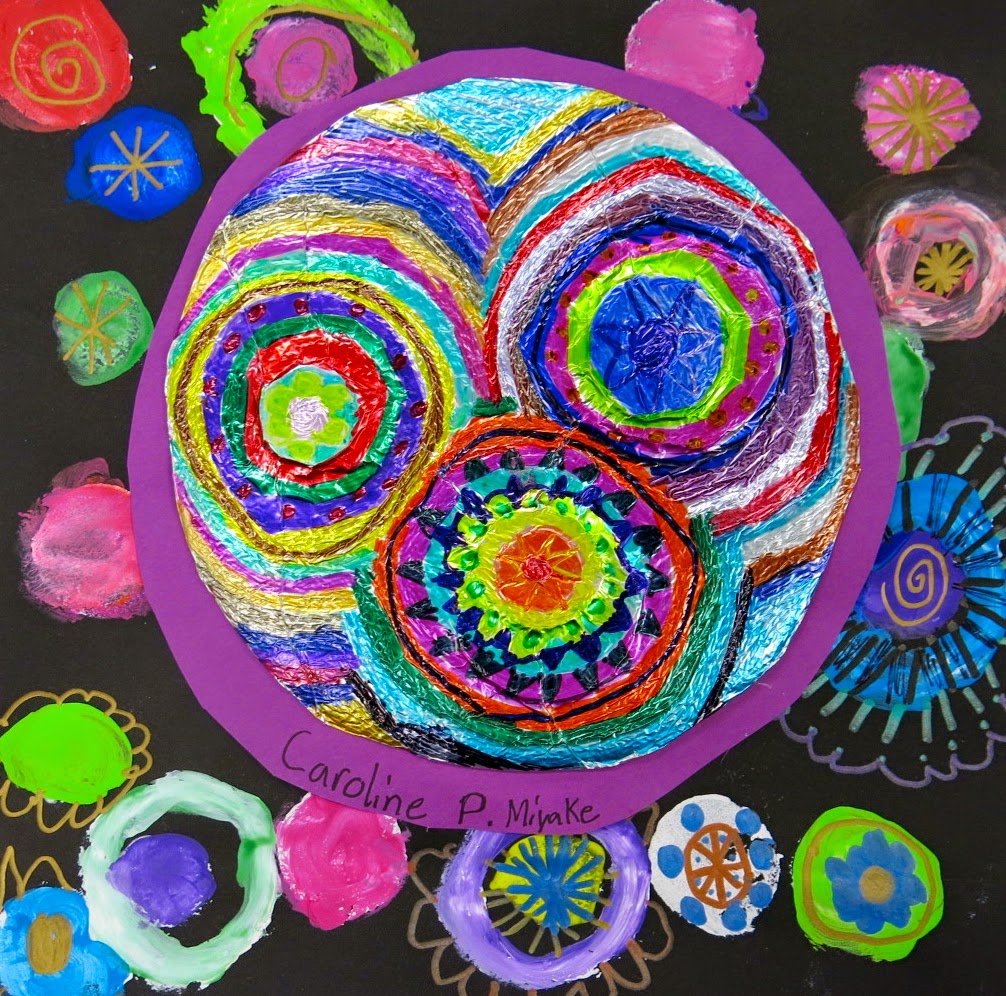
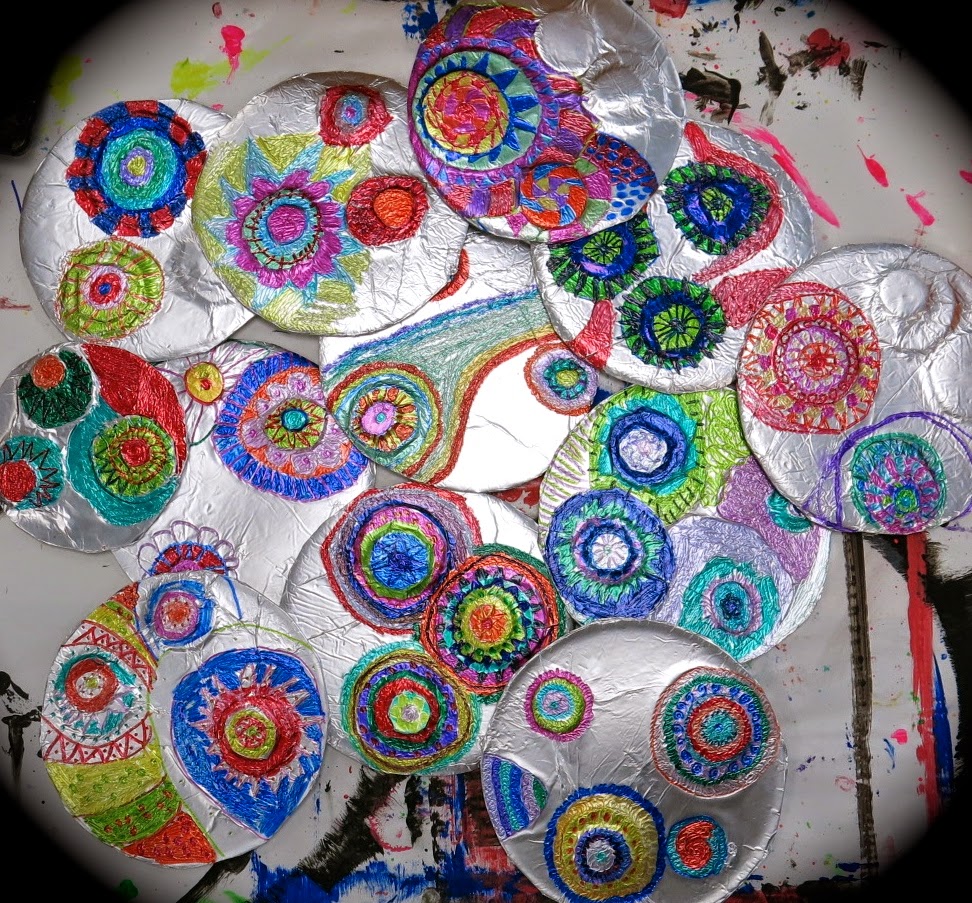
After reading The Dot, the kids traced a circle that was the size of the center of their styro plates. After cutting out two circles, they used one as the base for their relief sculpture. The other circle was used to trace bottle caps and cut out smaller circles. These were glued to the larger circle. After they had a minimum of three smaller circles with a maximum of two stacked on top, they visited me at a separate table where I hit their work with a shot of spray glue and slapped a piece of foil on top. They returned to their seats to "massage" the foil and reveal the circles underneath. The extra foil was cut away from the circle and tucked underneath. Then the fun of coloring designs in sharpies began...


I gave the kids a zen-tangle-meets-circles idea sheet to get the ball, er dot, rolling. I'm a big believer in what we call "idea sheets" as I'm one of those artists that always needs ideas and never just has 'em pop into my lil head. For my wee artists that are the same, I provide idea sheets. The kids know that they are just ideas and they don't have to use them if they don't need 'em.
After the first hour of work, their dots looked a lil like this. I loved 'em so but I just couldn't imagine them being hung like this. So the kids began working on dotted frames to mount them.
Which were stamped with round stamps in white. The kids added color to the white dots with either paint or makers. Once those dried, they embellished their frames with Magical Metallic Markers (which are only "magical" because I told the kids I'd bought 'em just for them and that their nemesis, the fourth graders, had not used 'em yet. This got a lotta yesssss!es from the third grade crowd.)
To mount 'em, the kids chose a colorful piece of paper that they thought enhanced their design. A larger circle was traced and their metal dot was glued atop.
And that was then glued to their super groovy dot-erific frame.
The kids all loved how Peter H. Reynolds signed his name with his middle initial and several of 'em followed suit.
I'd say there's no dot, er doubt about it, these bad boys are dot-alicious (okay, okay, I'll stop. But I'm at the end of my post, just trying to bring it all together for ya!).
Funny story: just this afternoon, my personal hero, our school bookkeeper, announced over my phone, "Mrs. Stephens! It's Christmas in the office, your supply order came in!" and wouldn't you know it, the kids cheered HURRAY! 

Looks like Mutha Stephens just hit the art teacherin' mutha load. Empty cupboards no more, yippie!

 photo signature_zpsd10b3273.png

Sunday, September 21, 2014

What the Art Teacher Wore #115 and a Blog Makeover!

Starting A-new Monday: Since all things Dot-astic are now behind us, we are now onto our new learning adventure: Latin America! To celebrate, I decided to wear some Latin-America duds this week. embroidered people sweater and Anthropologie dress: thrifted (I know, right?!); shoes: Frye, found on the cheap at Marshall's; necklace: Anthropologie; bangles: gifts from the fam

Hello, there friends! Welcome to my Brand Spankin' New Blog Layout! Y'all, I'm so excited about this. You see, I'm one of those lazy types that absolutely hates tackling new and (seemingly) overwhelming projects. My ole blog has needed an update for, like, ev-errrr. But I dreaded the thought for a coupla reasons: 1. I had absolutely no idea what I wanted and 2. I had absolutely no idea where to start. So after spending a couple of weeks scouring etsy for graphic designers ("a couple of weeks?!", you say. Well, yes. I get easily distracted by all the vintage clothing on etsy and may have purchased a dress or three whilst perusing graphic designers. Ahem), I found Rebekah of Le Charmed Boutique. She had the most glowing of reviews and was so affordable. I have to brag on her as she went through countless ideas and changes with me until I was totes thrilled with the result. Seriously, y'all. If you ever need yourself a custom graphic designer for design services of all types (she's working on a postcard for me now, thanks, Rebekah!), she's your gal. I'd love to know what you all think of the new layout. Once I get those tabs working, I'm hoping it will be easier for you to find whatever it is your looking for (even if that is to find your way outta here!).

On a different note, now that we've finished our adventures in all things dotty, we're moving on to our cultural theme of the year: Latin America! I thought I'd share with you just some of the inspiration for our upcoming projects. What are y'all up to now that the dot dust has settled? I'd love to hear!
Over the years, I've managed to score several arpilleras de adorno of Chile at thrift shops and garage sales. I've always been drawn to them because I love textiles and colors are so happy and cheerful. After a little homework, I discovered these pieces actually have a dark past. You see, on September 11, 1973 there was a coup in Chile. May of the men were arrested, imprisoned, exiled or simply never heard of again. This left the women to raise their children alone without a source of income. The Catholic church formed an organization to help these women find a way to make money. One was by creating these arpilleras (which means burlap as the original designs were stitched on that surface). Many of the original pieces serve as a narrative to show the hardship of these women. These works of art were often never signed for fear of being found out. These days the pieces are proudly signed by the artists that create them. 
It's Not Easy Being Green Tuesday: I found this sweet vintage skirt and blouse a while back but it had yet to make it's debut. That is until a buddy gave me an apron that matched it perfectly. I feel like I outta be workin' at some 1950's Mexican diner. skirt, blouse, apron: vintage; belt: Pin Up Girl Clothing; shoes: Crocs
Located near Mexico City is the little town of Metepec. Because of the rich clay deposits near the town, Metepec has long been home to many utilitarian potters. My fave, however, are the decorative pieces like the suns and the ceramic tree of life candle holders. Many of the pieces are actually created from molds (you can see this especially in the flowers and leaves) which I love. As an artist and an art teacher, you're lead to believe that molds, templates and stencils are bad and inhibit creativity. I think the work of Metepec does a good job of arguing that theory. 
Stitched Skirt Wednesday: Knowing what they do know about stitching from this project, my fourth graders were super curious how this skirt was created. I ain't ashamed to admit that I flipped the hem of my skirt to show them all the painstaking work that went into this number. sweater: Betsy Johnson, Buffalo Exchange; top: Target; skirt: one of my fave etsy shops, SassySenoitaVintage
Amate is a type of paper that has been produced in Mexico since pre-Hispanic times. This paper was produced for communication, record keeping and ritual during the Aztec Empire. During the Spanish conquest, the paper was banned and replaced with European papers. In the 1960's the Nahua people began painting their elaborate pottery designs onto the bark papers as it was easier to transport. They call these paintings "amatl". Each Nahua village has it's own style of painting making each unique.
Puffy Skirt Thursday: I would have to say that most days are better in a puffy skirt with a crinoline underneath...that is unless you are covered in chigger bites (like, even between my toes covered, y'all) and then every swish of that skirt brings on a cascade of itchiness. If you don't live in The South, count your chigger-less blessings as having these little bites on you is a scratch-tastic nightmare. top: Banana Republic, garage sale; skirt: vintage, thrifted
Xavier Castellanos is a Swiss-born, Mexican raised artist whose bright and colorful work I love. I love his "Mexican Landscape" series and can't wait to share this contemporary artist with the kids. This looks like a great inspiration for another mural project, dontcha think?
Mystery Machine Friday: So Friday we hit the road and got a jump start on our Halloween celebrating. To normal folk, it's still mid-September but for us, it's haunted-house, get-chased-by-crazy-people-wielding-chainsaws time. We hit Universal Studios in Orlando a little bit before their big Halloween Horror Nights event so we could hit the Harry Potter area and ride Gringot's Vault. Y'all. That ride was uh-mazing! dress: Anthropologie; sandals: Target

 photo signature_zpsd10b3273.png

Wednesday, September 17, 2014

In the Art Room: A Flower-y Mural for Dot Day

Well, now that the Dot Day dust has settled, I thought I'd share with y'all just how my lil first grade friends created this flower-y dot mural. It's been a big hit and I gotta say, I just love that it's planted, so to speak, right outside my room. It makes me feel like I'm walking into some sorta crazed Candyland everyday. Whiiiich I kinda am. Buuuut whatevers. Lemme first share with you my inspiration for the mural...
I pinned this beauty the moment I spied it on pinterest. I had no idea just how I was gonna use the idea but I knew I loved the piece. It's by an etsy artist who's handle (er, etsy-shop-name? I like "handle" better as my alter-ego is a chain-smokin, gravely-voiced, don't-take-no-shizzle trucker. What's yours?) heathergallerart. I love her whimsical colorful style. When I was scrolling through my pins for Dot Day, I rediscovered Heather's piece and decided it would make the perfect inspiration for our mural-tasticness. 
As I've blergged before (whuh, you didn't know that "blergged was the past tense to "blogged"? You, my friend, need to get your kitten mittens on an urban dictionary, stat), my first grade friends began this adventure with a lil intro to Wasilly Kandinsky and his concentric circles painting. Shortly after, the kids attacked a paper plate with their own concentric circle deigns. By the way, what you see above is known as "Crap! My paint order isn't in! Let's just use whatever we can scrap outta the bottom of the paint bottles." You'd think after your millionth year of art teacherin', you'd know to get your supply order in before school starts. Sigh.

Not like any of these artists noticed. They could paint with any ole thang and be perfectly happy. So glad to see they remembered that their Paint Brush Ballerina is to always paint on her tippy toes, never ever scoot around on her bottom (aka when-the-kids-scrub-their-brush-into-the-paper. Funny story, I used to call this Paint Brush Grinding until I realized that "grinding" was a form of dancing that shouldn't be mentioned in the art room. Ahhhhh-em). 

 The following art class, we blabbered about those ole Elements of Art and reviewed our chats about line from last year. Then I gave the kids what I like to call The World's Smallest Ballerina Paintbrush so they could create their delicate designs. I also gave the kids some watered down India ink which was ridiculous as one sweet girl promptly spilled the ink and ruined her top. Thankfully her mama wrote me a kind note saying, basically, "no worries!" and sent me a bag of chocolate. Shoot, I'll take that kind of punishment any day! To insure no more spillage, I placed the cups of ink in aluminum pie pans thus catching any spilled ink. Duh, why do I always get these ideas after the fact?
 For the flowery-petal portion of our dot-flowers were created on the following art class. The kids were given a folded piece of paper. On one side, we created a texture (you see how we keep hittin those Elements of Art? I'm tryin', y'all. I'm tryin'.) with my fave art room tool, the texture comb. On the other side, we used shape which, in this case, was a dot stamp. 
Once those dried, we did a lil math-ness. The kids were to fold their papers in half, trace two circles and magically cut out four (and it truly is magical in first grade which is why I love 'em so). From there they were to create eight half circles which stumped 'em for a hot minute before one of 'em realized (after doing some super cute simple math on her fingers), "you cut the four circles in half!" Once those were cut out, we glued 'em to the rim of our plate.
For the following art class, I had precut several squares of bulletin board paper. On each, I painted the start of a pattern with either black or white paint (for example, on this sheet, I painted asterix with dots on the tips). I gathered the kids around the giant sheets and asked them to pick a partner and pick a paper they'd like to continue pattern painting on. The sheets were just large enough to take up half table. The kids and their partners set to work. 
 And at the end of each class, we ended up with something that looked a lil like this. Which I've decided I'd like to have made into wall-to-wall carpet. Super cute, riiiiiight?
 Next came the assembling. I was a little worried that this might take me forever but it actually went by quickly once I figured out what in the world I was doing. Because I have four first grade classes, I went with four different trees. From there, I picked one of their patterned papers for the top, sky, back-, middle- and foreground. One that was decided, I curve-cut the tree and the landscape and proceeded to hot-glue 'em to each other. After that was assembled, the flowers were lightly glued into place (I want to be able to remove them at the end of the year to return them to the artists).
 Once all the pieces of the landscape and flowers where in place, I used that aforementioned, stain-your-clothes ink to outline the land and add a tree. I love their happy patterned papers, they made the perfect collage pieces! And the scraps, oh! Stay tuned as the kids have been using those to create paper bunting for our upcoming Mexican Fiesta!
And there you have it, our Crazed -n- Colorful Flowery-Dot Candyland! This mural was truly fun to make and brightens my day whenever I see it. I've loved seeing the many Dot Day murals y'all other art teachers have shared. What other murals do you have up your art-teacherin' sleeves? Lemme know, I'd love to hear. Until then!