Monday, September 5, 2016

In the Art Room: Monochromatic Selfie Mural

Oh, y'all. Murals. Every time I have the kids create the pieces for one I think to myself: THIS HAS GOT TO END. The crawling on the floor, the hot glue burns, the accidental stapling of flesh (in my thigh? For real tho?). Then I hang it up and immediately forget the pain and suffering. I just stand back and absorb the awesomeness that is the work of my wee artists. 
Like awww, y'all. These selfies created by my first through fourth grade students (with about a dozen missing as they still have some finishing up to do) are just about the best thing ever. And it already has me plotting and planning our next collaborative project. Because I'm a glutton for punishment. 
In case you missed it, we started our school year with a monochromatic self-portrait project. You can see the finer details here. The above is the video that I shared with the kids. 
And here is a look-see as to my set up. The covered tables signify the colors available at that table. The kids could use any ONE color they wanted (which meant for that first day, they sat where they liked) but if a table was filled up, then move along, Little Doggie. On the tables there were two bins filled with markers and colored pencils of one color in a range of values. There were also mirrors on each table. 
At the end of the first week, I had a stockpile of these lovelies that I organized by color. Initially I was going to do something COMPLETELY different with these selfies. However, tried as I might to make the idea work (I was going to make a big ole peace sign), it just wasn't coming together. So I shelved the idea, allowed myself to let it go and I flipped my flop... 
And went with this idea instead: The Many Faces of J.E.S. 
Our students have a STONG sense of school pride. They are happy kids who truly love their school. Our school colors are yellow and blue. I think they are gonna totally dig this mural when they see it tomorrow!
But, like I said, the gluing, mounting, plotting and planning is what completely wears me out. I did this on a Sunday just so I could knock it out with plenty of uninterrupted time. And so no child could witness giant extension cords and hot glue guns on the ground. Is it any wonder why I am so accident prone? I set myself up for disaster. I truly am my own biggest enemy!
Next up: kindergarten still needs to create selfies. AND I had the posters that the kids created in this post laminated. I can't wait to hang them up alongside this mammoth masterpiece. 
I'm also stoked that this is up two whole weeks before Open House! Now I just gotta get three grade levels of Dot Day artwork up...whew. That outta be a good time. 
In the meantime, I'll just be hanging out with some colorful kids.
Who are so uniquely different. I love seeing the variety of creativity!
By the way...I may be a little spotty this week as I'm having a ROOT CANAL tomorrow. Be thinkin' of me y'all. And floss. A lot.
 photo signature_zpsd10b3273.png

Thursday, September 1, 2016

In the Art Room: Radial Design Printmaking

I love art teachers because they have the best ideas and are super sweet about sharing them. This idea comes courtesy of art teacher Jeanna Pena (who you can follow on Facebook and Twitter for all of her art adventures). When she shared this lesson in the Art Teachers Facebook group, I immediately decided to scrap the lesson I had planned for my fourth grader's Dot Day project and go with this one. And I'm so glad I did. It was such a smash hit of a lesson (with still one more round to go as we'll be covering these printing plates and burnishing them next week, a la this project) that I just can't thank Jeanna enough for sharing. So, with her permission, I'm sharing my version of her lesson here!

But first, a word about Jeanna. She's pretty stinkin' awesome. I noticed from a wee bit of Facebook stalking that she seemed to be quite the adventurer. Here's what she had to say: I came up with this idea after I traveled to Cuba last fall. I was attempting to translate the radial tile patterns that I saw in some amazing old buildings.

I applied for the Grosvenor Teacher Fellowship with National Geographic and Lindblad Expeditions and it has been a whirlwind! They are sending me to Antarctica in December. They brought our group together in DC and we had photography lessons at NatGeo HQ, naturalist updates, and classes with the Google Educational Engagement folks. I'm the only art teacher. They're looking for adversity in content areas! I highly recommend it!

How awesome is Jeanna?! If you have a moment to show her some love in the comments for this awesome lesson, please do so. AND if you have any questions about her travels, you can find her on those social media links above.
Now, let's talk about this project. It was our first for the new school year, right after we wrapped the Escape Game and the Monochromatic Selfies. Jeanna had mentioned she did this project with her older students...so I wasn't sure how my kids would do being brand new fourth graders and all. But they knocked it out of the park! Here is the video they viewed on the first day.
Supplies:

* Cardboard. We used cardboard rounds because of our Dot Day focus which were purchased from Amazon. However, any cardboard or mat board would work. 
* Foam Sheets and/or Shapes with Adhesive Back. I found that Michael's had the best selection where Joann's fell short. I did purchase foam sheets because I knew some kids would want to explore creating their own shapes. Some foam sheets were not adhesive backed so the kids glued them on. Those we found did not stick super well when it came to printmaking. When they came off, I just had the kids bring their board to me and I hot glued them back on.
If you follow me on Insta then you've seen our progress. I had my early finishers recreate their design on scratch paper (also purchased via Amazon) and write about what they learned. 
The following art class, we printed! And, with about 35 fourth graders in the room it was, well, busy. We'll just call it busy.
* Printing Ink. Y'all. ALWAYS buy water soluble Speedball. I have had the same jars of ink forever. I just keep adding water, stirring and it still works great. Unlike the "house" brands that the art supply vendors sell which harden in the tube. 

* Inking Trays. You can purchase these through your art supply vendor. However, with this many kids, I did run out so I simply cut my Gelli Arts plastic containers in half and used those. I'm sure something could be found at the Dollar Tree for this item.

* Paint. We used tempra paint for rolling on texture/color on the background.

* Brayers. I happened to have one per kid so there was no wait time. 

* Paper. We  used 14" squares that I had cut down from large paper. 
Day two's video: honest speaking, I didn't show the entire start of the video to my second group of fourth graders. Knowing that they are a group that likes to move, I knew I'd need to get them working right away. So I started the video just before the demo portion. 
And then they went to work! They had a BLAST.
And the prints turned out so colorful and fun just like the artists. 
A little "before" action. Don't ask me what the aftermath looked like. I've blocked it out.
I had a couple of kids double stack their shapes which I wasn't sure just how that was going to turn out...but I really dig it. Check out the triangles. 
I can really see so much potential with this printing project: a lesson on architecture, a portrait project, floral creations...the possibilities are endless!
Yeah, ya did.
For now I'm just gonna keep taking them off the drying rack and saying Ooooooh and Aaaaaah. Stay tuned for what happens next with these beauties.
 photo signature_zpsd10b3273.png

Wednesday, August 31, 2016

Art Teacherin' 101: Episode 17

So you created this fabulous lesson and it's got it all: vocabulary, a cultural tie-in, skills-learned and an exploration of a variety of media. It's big, it's beautiful and you just can't wait to share your Titanic of an art lesson with the kids. Basically, you are all kinds of Dicaprio.
And then, for whatever reason, your Titanic of an art lesson starts to spin outta control...
hits an iceberg and, well, you know the rest.

What do you do with a lesson when it flops? That's the topic of this week's 101! 
I could paper my art room with all of the lesson plans I've written that have flopped. The key is not to place blame or feel shame but think objectively about what didn't work and fix it. OR forget it. And don't look back if you do.
I decided to flip first grade's flop. In the end, they LOVED making these dream catchers...but the first day of the lesson, I really thought there was gonna be a coup to overthrow the art teacher. Would I do this lesson again? Knee-jerk answer: HECK TO THE NO. Ask me in a couple months and I'll be all about the YESSSSS! 

By the way, because of said floppiness, I probably won't be sharing that lesson here...unless y'all are interested. I pulled the project idea from a couple of blogs that went about doing it in a way that proved to be too tough for my 6 year old set. I flipped it around to work for my kids. Cuz that's what we do with a flop.
In other news, here is my full Shibori ensemble. It was ranked MEH by a fourth grader today. C'est la vie. Y'all know I'm totes addicted to dying now, right?! I cain't stop! 

 photo signature_zpsd10b3273.png

Tuesday, August 30, 2016

In the Art Room: You Be You Collaborative Project!

Sometimes I do believe I am my own worst enemy. Despite the fact that the Monochromatic Self-Portrait mural is not up (and by "not up", I mean I've yet to even mount it!), I decided to plan another collaborative piece for the kids. Crazy? Def. Nobody ever said teaching art was for the sane. 

Y'all might recall that my theme this year is kindness which I believe begins with a love for oneself. After all, you cannot be a loving person without loving Numero Uno, right? And that's what I really love about You Be You by Linda Kranz
It's a beautifully colorful book (where the fish are actually painted on rocks!). Not only do I love the message and the illustrations but I love that I can (re)introduce my students to the elements of art with this fun lesson. Originally I was only going to do this project with my third grade. However, it was such a hit with them (and such a fast project), I decided to have second (and possibly firsties!) create a fish as well. The more fish the better our collaborative mural, says the crazy art teacher. Here is the instructional video I shared with my students:
Feel free to use it in your art room! My students had idea sheets on their tables that really let them explore a variety of possibilities. 
I encouraged them to come up with their own ideas. They are used to having "idea sheets" on their tables for inspiration. And, since there were a lot of directions given, I also provided a review of the steps on the tables as well...
In the video, I used oil pastels because that was all I had on hand at home. However, my school oil pastels are down to stubs so I gave the kids construction paper crayons to use. My third graders whizzed thru their drawing and coloring so fast that I decided to bust out the puffy paint because...PUFFY PAINT RULES.
These took us our entire hour with a little time left over to check out everyone's fish. Next up: painting the large mural that the fish will be placed in! I'll definitely share a follow up post as we work on that in the next week.
By the way, if you are curious about the circles the kids painted on...they were painted by first grade! First grade is wrapping up a dreamcatcher project where they had to use a paper plate (details on THAT project in tomorrow's Art Teacherin' 101 titled WHAT NOT TO TEACH IN THE ART ROOM. Spoiler Alert: it's dream catchers). The first grade painted paper plates and then the center was cut out to make room for their 'catcher. Instead of recycling them, I decided to have the kids use them for this project!
Let's talk about how cute and original these fish are, can we? This boy LOVED that his fish looked just like him, complete with glasses and missing teeth.
And this new student really surprised me with his level of detail. I thought for sure he'd color over all of his lines. I was happy to see that he took the time to color each section. This project served as a great assessment tool. 
This project was so fun that I'm thinking of having the kids do a follow-up project that involves them painting their own rock a la Linda Kranz. 
 By the way, I know I recently shared my I Can board on instagram and had some inquiries...here's a close up. I don't get too specific on my board because I ain't got time for that. I do find it's helpful both for me and the students to have this visual. 
By the way, the pencil and the notebook came courtesy of the Target Dollar Spot. I just used black acrylic to paint the grade level and puffy paint (again, because PUFFY PAINT RULES!) on the felt notebook paper. 
And there you have it, You Be YOU! Stay tuned for our completed mural...and be sure to pop by tomorrow for Art Teacherin' 101. 
 photo signature_zpsd10b3273.png

Thursday, August 25, 2016

In the Art Room: Tissue Paper Relief by Third Grade

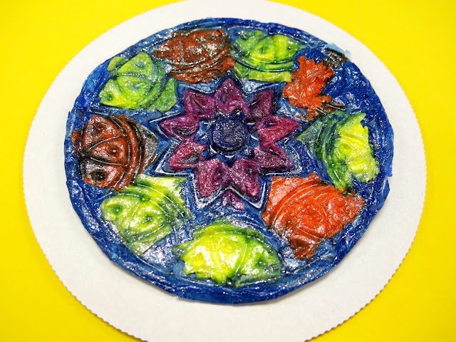
Now that our Monochromatic Selfies are complete, the third grade was ready to spend their third day in the art room creating tissue paper reliefs! I've been looking for a different spin on Dot Day and when I saw Blick present this at the AOE Now summer conference, I knew I had to give it a go!
This project took us the hour to complete and made for so much prettiness (not to mention educatin'). I created the video to share with my students...but you are welcome to share it with yours! 
Now, the relief might be finished but the project isn't complete yet! Our next step will be to adhere them to 10" cardboard rounds found on Amazon (I just have them sitting on 8" rounds for the photo) and continue our study of radial balance. I'll be sure to share that with you when they are complete. I was just too excited by these lovelies not to share right away!
 I mean...so fun, right?
 For this project, you'll need some of the following:
* Texture plates I used the ones that was recommended by Blick at the AOE conference. I liked the circle design as it went perfectly with our Dot Day lesson. However, they have a ton of cool texture plate designs to chose from. I purchased thirty plus because that's how many third graders I have in a class...and the artwork will need to remain in the texture plate until completely dry. 
 * Tissue paper squares These small squares are PERFECT if the kids are wanting to create a design. I left that completely up to the students. Many chose to create a radial design on their plate while some did a random one. I was cool with both. 
I was DREADING the idea of cutting tissue paper. I was so excited when I found these at the Dollar Tree! I purchased one for each table of four students and it was more than enough. It is a bleeding tissue, however...so some designs may get a little fuzzy around the edges. I was willing to take that as opposed to cutting thousands of squares.
* Large Tissue Paper This is where all of your scraps come in handy. The kids were instructed to use the smaller pieces for their design portion. When that was complete, they were to put AT LEAST three layers of large tissue on the back to strengthen the tissue design. 

* Watery Glue...with GLITTER! I just put white glue and water in a cup and sprinkled glitter into that. The kids also used soft brushes to apply the glue. Anything bristly tour the tissue more than normal. 
The kids put a piece of tape on the back of the plate with their name and teacher code. Here's what they look like as they are drying...not so interesting as the cool design is underneath!
 Not even gonna lie: the big draw back to this project was popping the creations out of the plate. Because the tissue is pretty fragile, I knew the kids might accidentally tear their work and become frustrated. It took me about 10 minutes to bust all of these bad boys out of the texture plates. I did crack a few of the plates while doing so...but they're fine to use again. 
Once popped out, the kids will trim around their circle design, cutting off the excess. 
 I know they'll be thrilled to see them when they get them back!
 Next up: add to a cardboard round and continue the radial design! 
This was such a fun and unique project that the kids really enjoyed. I don't often repeat projects but I can see this one happening again in the ole art room sometime soon!

 photo signature_zpsd10b3273.png